From Digital to Print: Ensuring Color Accuracy in Your Designs
Tony Torres
Mastering Color Accuracy from Screen to Print in Design
As a designer, ensuring that the colors in your digital designs translate accurately to print is a critical aspect of the creative process. In this comprehensive guide, we'll explore the essential steps and best practices for maintaining color consistency from your screen to the final printed product.
Understanding Color Models: RGB vs. CMYK
Before diving into color accuracy, it's important to understand the difference between RGB and CMYK color models. RGB, used for digital screens, stands for Red, Green, and Blue. CMYK, on the other hand, is used for printing and stands for Cyan, Magenta, Yellow, and Key (Black).
Color Calibration: The Foundation of Color Accuracy
Color calibration is the process of adjusting your monitor's color settings to match a standard color profile. This ensures that the colors you see on your screen are as close as possible to the colors that will be printed.
Choosing the Right Color Profile for Your Project
Selecting an appropriate color profile is crucial for color accuracy. Profiles like sRGB and Adobe RGB have different color gamuts, so choose one that matches your project's requirements and the final output method.
Proofing and Prototyping: Previewing Your Printed Design
Proofing involves creating a sample print to check for color accuracy before running the full print job. Prototyping, or creating a mock-up of your design, can also help you visualize how colors will appear in the final product.
Communicating with Printers for Optimal Results
Clear communication with your printer is essential. Provide them with all necessary color profiles and specifications to ensure they can accurately reproduce your design's colors.
The Role of Paper and Ink in Color Reproduction
The type of paper and ink used can significantly affect how colors are reproduced. Different paper textures and weights can alter the appearance of colors, so consider these factors when planning your design.
Lighting Conditions and Their Impact on Color Perception
Lighting plays a crucial role in how we perceive color. Viewing your design in lighting conditions similar to where the final product will be displayed can help ensure color accuracy.
Software Tools and Resources for Color Management
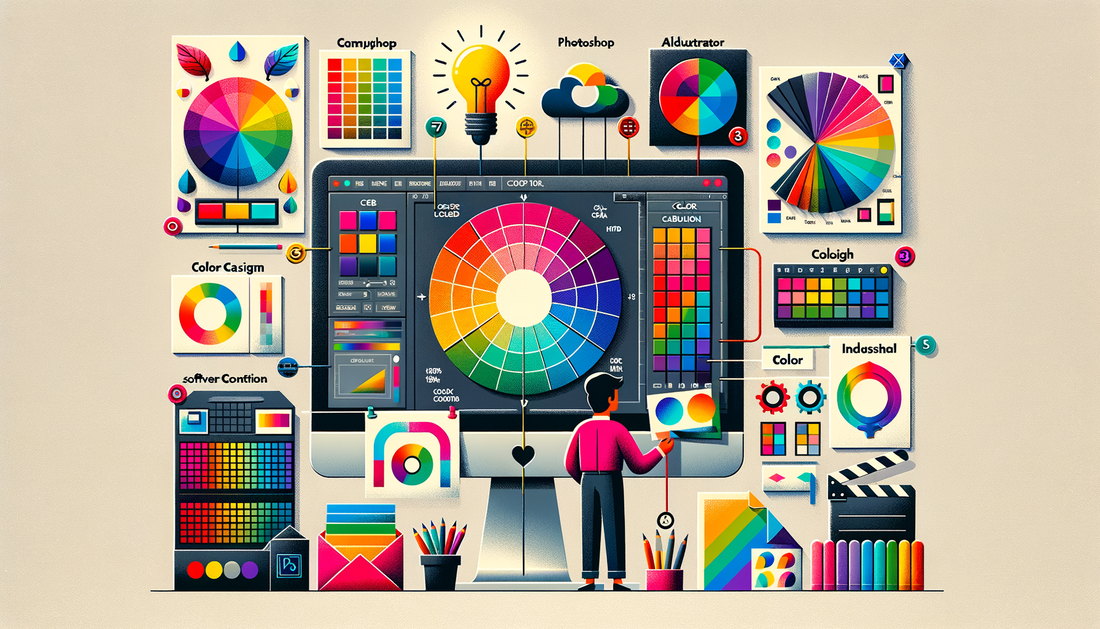
There are various software tools available that can assist with color management. Adobe Photoshop, Illustrator, and InDesign all offer features to help you manage colors effectively throughout your design process.
Continuous Learning and Adaptation in Color Management
Color management is an ongoing learning process. Stay updated with the latest tools, technologies, and best practices to consistently achieve accurate color reproduction in your designs.
Color accuracy from digital to print is a complex but manageable task. By understanding color models, calibrating your devices, proofing, and communicating effectively with printers, you can ensure that your designs look as intended when printed. Remember to consider the impact of paper, ink, and lighting, and utilize the right software tools to aid in your color management journey.
